


Palazzo
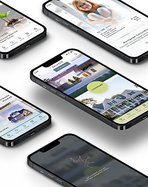
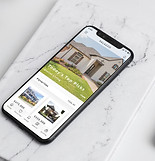
I created the Palazzo app to support and guide first-time homebuyers through the often intimidating process of property investment. Focused on a streamlined design approach and easy usability, the app provides the essential tools for users to achieve their goals by offering a user-friendly and intuitive experience, with curated property listings and educational resources to empower them in making informed decisions.
Palazzo aims to be a central hub for all real estate needs, providing a quick, easy, and worry-free experience for future homeowners.
Problem space
Users need a way to quickly and easily find, access and catalogue property listings and educational materials, because they aim the streamline the property search process in order to more efficiently make informed real estate investment decisions.
We will know this to be true when we observe a significant decrease in the time users spends on property searches and an increase in her/his satisfaction with the information provided, as measured through user feedback and engagement metrics.

My role
UI Designer
Design objectives
1. Develop a search and information retrieval system that allows users, especially those new to real estate, to quickly find and catalogue relevant properties and their details.
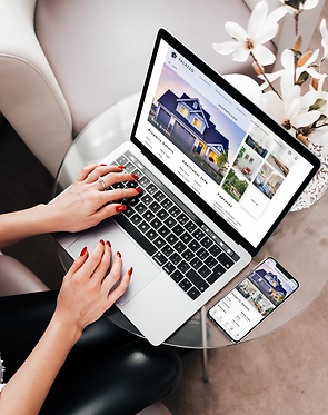
2. Create a responsive tool that ensures a consistent and easy user experience across multiple platforms
3. Provide users with rapid and intuitive access to information about properties, as well as educational resources to facilitate informed decision-making regarding real estate investments.
Rashida - the persona
“I want to provide my family with financial security. I’ve been considering buying property for a while, and am looking for a tool that can help me find what I’m looking for, quickly!”
Age:
Profession:
Tasks:
-
35 - 45
-
IT Consultant in tech
-
Search for properties, inputting criteria relevant to what she’s looking for
-
Easily view and return to listings she’s interested in
-
Receive relevant and comprehensive information about properties
-
Access authoritative educational materials to help me in my decision-making

Research
Conceptualize
Design
Competitive Analysis
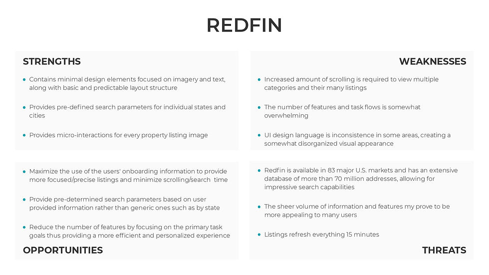
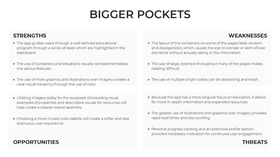
Before beginning the design process for Palazzo, a competitive analysis was conducted for 3 of our main competitors: Redfin, Realtor.com and BiggerPockets GOALS: ● Understand user expectations and hypothesizing how they might interact with our product. ● Uncover potential gaps in the market ● Inform the design process in order to address the specific needs and preferences of our users

Key takeaways
Clear Hierarchy
Prioritizing clearer visual hierarchy through color, font and the use of only necessary imagery will enhance usability and app performance.
Precision & Personalization
Leveraging opportunities to provide results based on user parameters will offer a quicker, more streamlined and more personalized experience where precision and performance is offered over volume
UI Design Patterns & Consistency
Focusing on simplifying the user interface and implementing visually leading layouts and more consistent design patterns will improve readability, comprehension, and reduce cognitive load, thus creating a more user-friendly experience
Research
Conceptualize
Design
Proposed Solutions
To meet the users need for a rapid, easy-to-use and comprehensive tool, I proposed that by focusing on facilitating efficient property exploration through features such as ideal property criteria, preset property search and filtering, and the ability to compare properties, the Palazzo app will do most of the "heavy lifting" for the user. In doing so, the app would ensure: ● A streamlined, user-friendly experience for multitasking professionals, ● Quick input of preferences and rapid searches ● The ability to bookmark top property matches and contact realtors directly ● Easy access to relevant tools and resources in a dedicated Resources section
User flows
Mood board
Inspiration:
-
Modern sophistication and minimalism (aligning with our design goal of a sleek and intuitive user experience)
-
Clean and cohesive visual language (seen in the Quattrocento and Muli Fonts, and the squared outline icon set)
-
Contemporary warmth
-
Professionalism
Research
Conceptualize
Design
Iterating solutions
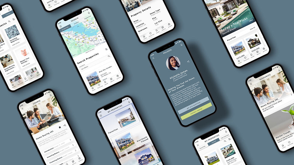
Creating balanced wireframes and mockups with uncluttered layouts that were minimally image-focused supported the app’s goals for an efficient and streamlined experience. With fewer micro-interactions, property information bound by onboarding specifications, and task flows with limited entry points I aimed to create a UI experience that aligned the both the brand and the user goals. By balancing visuals with supportive text I strove to enhance the app's visual appeal while promoting efficient property exploration, and offering easy access to educational materials ,thus ensuring reduced cognitive load and a stress-free user experience.
Wireframes


Color
Surface: minimalism, clean backdrop for images and text
Light Blue: professionalism, trustworthiness
Green: calmness, approachability, energetic
DarkTone: sophistication, contrast
Primary Palette
Surface: surface color and backgrounds Primary: primary CTA's and final onboarding page background Secondary: secondary CTA buttons and backgrounds Tertiary: accents such as location indicators or selected tabs, and backgrounds Text 1: titles, headings, body text, and icon lines
Surface
#FAFAFA
250, 250, 250
Primary
#CED984
206, 217, 132
Secondary
#ABC0CE
171, 192, 206
Tertiary
#5E7888
94, 120, 136
Text 1
#32383C
50, 56, 60
Secondary Palette
Elevation: level 1 elevation on Surface background Success: password strength validation Error: error messages
Elevation
#FFFFFF
255, 255, 255
Success
#2AC130
42, 193, 48
Error
BA1A1A#
186, 26, 26
Gray Palette
Gray LT: dimmed background underlay Text 2: supportive text and navigation elements Gray DK: darkened background underlay
Gray LT
#E2E2E2
226, 226, 226
Text 2
#A9A9A9
169, 169, 169
Gray DK
575C5F#
97, 92, 95
Mobile mockups
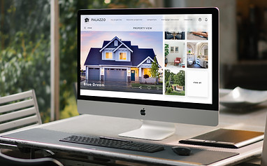
Responsive Framework
GOALS:
-
Ensure that the app provides a consistent experience by maximizing learnability across platforms through the use of recognizable design patterns, layouts and entry points for task completion.
-
Optimize the use of grids, layout, hierarchy and imagery to ensure brand consistency in regards to visual aesthetics, recognition and usability


Final Outcomes
Final takeaways
Balancing Information and Aesthetics:
Rapid User Experience:
User-Friendly Responsive Design:
Providing sufficient information about properties to users without cluttering the app's visual aesthetics proved difficult. By prioritizing balanced visual design and customizing results and information based on onboarding criteria, I was able to effectively minimize visual clutter while still delivering necessary information.
Striking a balance between minimalist design and rapid performance was a primary concern in designing the Palazzo app. By tailoring results and resource materials, I aimed to minimize load times by reducing the amount of unnecessary content while ensuring that users receive personalized and relevant information quickly.
Ensuring a user-friendly app for all users across platforms was also paramount. By implementing responsive design principles that increased learnability and leveraged recognizable design patterns across devices, I was able to ensure that the app remains accessible to a diverse user base.


